CSS Flex 弹性布局
海边的小溪鱼 2022-07-14 CSS
Flex 布局,可以简便、完整、响应式地实现各种页面布局
注意:设为 Flex 布局以后,子元素的 float、clear、vertical-align 属性将失效。
任何一个容器都可以指定为 Flex 布局
.box {
  display: flex;
}
1
2
3
2
3
行内元素也可以使用 Flex 布局
span {
  display: inline-flex;
}
1
2
3
2
3
Webkit内核的浏览器,必须加上 -webkit 前缀
.box {
  display: -webkit-flex; /* Safari */
  display: flex;
}
1
2
3
4
2
3
4
# 1. 写在父元素身上的 6 个属性
# (1)flex-direction 属性:设置主轴方向,有如下 4 个值
| 值 | 说明 | 效果图 |
|---|---|---|
| row | 默认,主轴为 x 轴(水平方向),从左到右排列 | 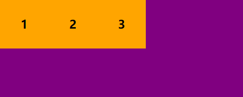 |
| row-reverse | 主轴为 x 轴(水平方向),从右到左排列 | 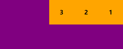 |
| column | 主轴为 y 轴(垂直方向),从上到下排列 | 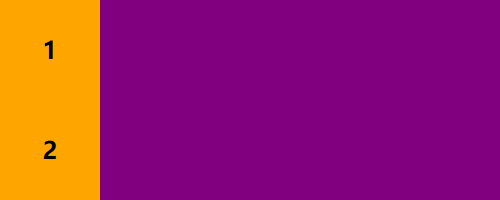 |
| column-reverse | 主轴为 y 轴(垂直方向),从下到上排列 | 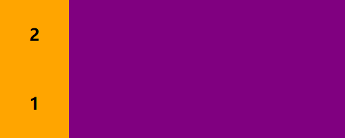 |
.box {
    display: flex;
    flex-direction: row | row-reverse | column | column-reverse;
}
1
2
3
4
2
3
4
注意:主轴和侧轴是会变化的,就看 flex-direction 设置谁为主轴,剩下的就是侧轴(子元素是跟着主轴来排列的)
如果设置主轴为 X 轴,那么 Y 轴就是侧轴
如果设置主轴为 Y 轴,那么 X 轴就是侧轴
# (2)flex-wrap 属性:是否换行(一行排不下时),有如下 3 个值
| 值 | 说明 | 效果图 |
|---|---|---|
| nowrap | 默认,不换行 |  |
| wrap | 换行,第一行在上方 |  |
| wrap-reverse | 换行,第一行在下方 | 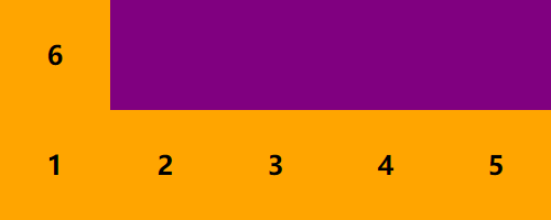 |
.box {
    display: flex;
    flex-wrap: nowrap | wrap | wrap-reverse;
}
1
2
3
4
2
3
4
注意:flex布局中,默认子元素只能在主轴上 一行/一列 排列,是不换行的,换行需要父元素添加 flex-wrap 属性
当父元素盒子装不下其他子盒子时(超出父盒子宽/高度),会把所有子盒子平均分成几等分一行/一列排列(会缩小子元素的宽/高)。
# (3)flex-flow 属性:是 flex-direction 和 flex-wrap 属性的简写形式
| 值 | 说明 | 效果图 |
|---|---|---|
| row nowrap | 默认;主轴方向为 x 轴,从左到右排列;不换行 | |
| column wrap | 主轴方向为 y 轴,从上到下排列;换行,第一行在上方 | 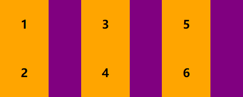 |
.box {
    display: flex;
    flex-direction: column; /* 设置主轴为 y 轴(垂直方向),从上到下排列 */
    flex-wrap: wrap; /* 换行(主轴排不下时换行) */

    /* flex-direction 和 flex-wrap 的简写形式 */
    flex-flow: column wrap; /* 默认是 row nowrap */
}
1
2
3
4
5
6
7
8
2
3
4
5
6
7
8
# (4)justify-content 属性:子元素在主轴上的对齐方式,有如下 5 个值
| 值 | 说明 | 效果图 |
|---|---|---|
| flex-start | 默认值,左对齐(盒子之间没有空隙) |  |
| flex-end | 右对齐(盒子之间没有空隙) | 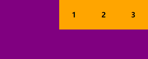 |
| center | 居中对齐(盒子之间没有空隙) |  |
| space-between | 两侧盒子先贴边,再平分剩余空间(盒子之间间隔相等) | 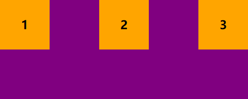 |
| space-around | 平分剩余空间 | 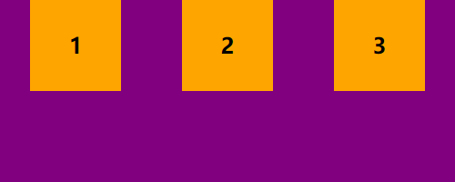 |
.box {
    display: flex;
    justify-content: flex-start | flex-end | center | space-between | space-around;
}
1
2
3
4
2
3
4
注意:以上效果图默认主轴方向为 X 轴(水平方向)的情况下
如:justify-content: center;
如果主轴为 x 轴 则水平居中对齐,如果主轴为 y 轴 则垂直居中对齐
# (5)align-items 属性:子元素在侧轴上的对齐方式(只对单行有效),有如下 5 个值
| 值 | 说明 | 效果图 |
|---|---|---|
| stretch | 默认值,如果子元素没有设置高度,将占满整个容器的高度 | 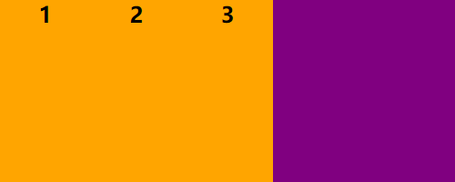 |
| flex-start | 在侧轴的头部开始排列(盒子之间没有空隙) |  |
| flex-end | 在侧轴的尾部开始排列(盒子之间没有空隙) |  |
| center | 在侧轴居中显示(盒子之间没有空隙) | 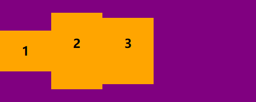 |
| baseline | 文字的基线对齐 | 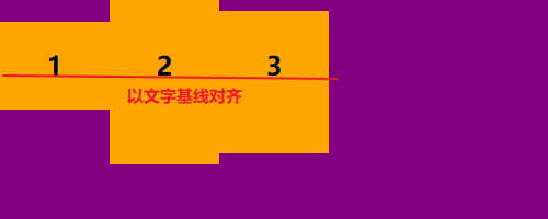 |
.box {
    display: flex;
    align-items: flex-start | flex-end | center | baseline | stretch;
}
1
2
3
4
2
3
4
注意:以上效果图默认主轴方向为 X 轴(水平方向)的情况下
如:align-items: center;
如果主轴为 x 轴 则垂直居中对齐,如果主轴为 y 轴 则水平居中对齐
# (6)align-content属性:设置侧轴上的子元素排列方式(只对多行有效,必须有换行属性)
| 值 | 说明 | 效果图 |
|---|---|---|
| stretch | 默认值,如果子元素没有设置高度,轴线占满整个交叉轴 | 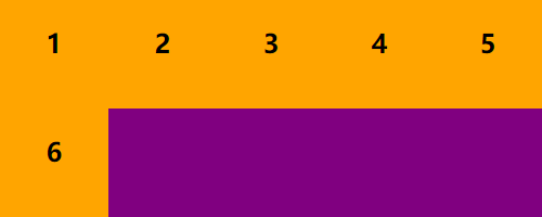 |
| flex-start | 在侧轴的头部开始排列(盒子之间没有空隙) | 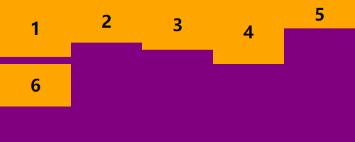 |
| flex-end | 在侧轴的尾部开始排列(盒子之间没有空隙) | 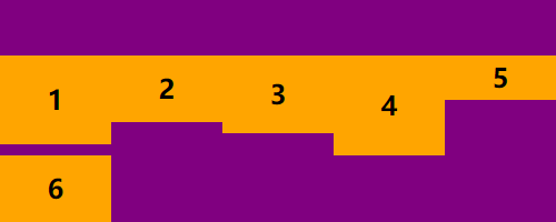 |
| center | 在侧轴居中显示(盒子之间没有空隙) | 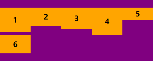 |
| space-around | 平分剩余空间 | 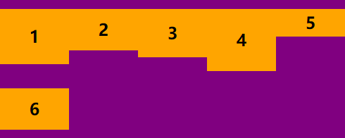 |
| space-between | 两侧盒子先贴边,再平分剩余空间(盒子之间没有空隙) | 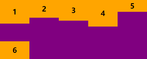 |
.box {
    display: flex;
    flex-wrap: wrap; /* 必须要有换行属性 */
    align-content: flex-start | flex-end | center | space-between | space-around | stretch;
}
1
2
3
4
5
2
3
4
5
注意:以上效果图默认主轴方向为 X 轴(水平方向)的情况下
如:align-content: center;
如果主轴为 x 轴 则垂直居中对齐,如果主轴为 y 轴 则水平居中对齐
# 2. 写在子元素身上的几个常用属性
# (1)flex 属性:分配剩余空间
<html>
<body>
    <div class="box">
        <div class="son1">1</div>
        <div class="son2">2</div>
        <div class="son3">3</div>
    </div>
</body>
<style>
    .box {
        width: 500px;
        height: 200px;
        background-color: purple;
        display: flex;
    }
    .son1 {
        width: 100px;
        height: 100%;
        background-color: orange;
    }
    /* flex 属性:为子元素 分配 剩余空间(用 flex 来表示占用份数) */
    /* 剩余空间 = 父盒子的大小 - 子盒子的固定宽高 */
    /*
        分配剩余空间:
        1. 首先把所有子元素 flex 数量加起来分几份(2+1=3)
        2. 再看自身占几份,就是占几分之几
    */
    .son2 {
        flex: 2; /* 占剩余空间的 2 份:3分之2 */
        background-color: green;
    }
    .son3 {
        flex: 1; /* 占剩余空间的 1 份:3分之1 */
        background-color: red;
    }
</style>
</html>
1
2
3
4
5
6
7
8
9
10
11
12
13
14
15
16
17
18
19
20
21
22
23
24
25
26
27
28
29
30
31
32
33
34
35
36
37
2
3
4
5
6
7
8
9
10
11
12
13
14
15
16
17
18
19
20
21
22
23
24
25
26
27
28
29
30
31
32
33
34
35
36
37
# (2)order 属性:定义项目的排列顺序(数值越小,排列越靠前,默认为0)
<html>
<body>
    <div class="box">
        <div class="son1">1</div>
        <div class="son2">2: 我想当老大</div>
        <div class="son3">3</div>
    </div>
</body>
<style>
    .box {
        width: 500px;
        height: 200px;
        background-color: purple;
        display: flex;
    }
    .son1, .son2, .son3 {
        width: 100px;
        height: 100%;
        background-color: orange;
        /* 各占剩余空间的 1 份:3分之1 */
        flex: 1;
    }
    .son2 {
        background-color: green;
        /* order 属性:定义项目的排列顺序(数值越小,排列越靠前,默认为0) */
        order: -1;
    }
    .son3 {
        background-color: red;
    }
</style>
</html>
1
2
3
4
5
6
7
8
9
10
11
12
13
14
15
16
17
18
19
20
21
22
23
24
25
26
27
28
29
30
31
32
2
3
4
5
6
7
8
9
10
11
12
13
14
15
16
17
18
19
20
21
22
23
24
25
26
27
28
29
30
31
32
# (3)align-self 属性:控制自己在侧轴的排列方式(允许自己与其他项目不一样的对齐方式)
<html>
<body>
    <div class="box">
        <div class="son1">1</div>
        <div class="son2">2: 我们不一样</div>
        <div class="son3">3</div>
    </div>
</body>
<style>
    .box {
        width: 500px;
        height: 200px;
        background-color: purple;
        display: flex;
        justify-content: space-between;
    }
    .son1 {
        width: 100px;
        height: 100px;
        background-color: orange;
    }
    .son2 {
        width: 100px;
        height: 60px;
        background-color: green;
        /* align-self 属性:设置子元素自己在侧轴上的排列方式 */
        align-self: flex-end; /* 尾部对齐(默认值 auto,其它值同 align-items 一样 ) */
    }
    .son3 {
        width: 100px;
        height: 150px;
        background-color: red;
    }
</style>
</html>
1
2
3
4
5
6
7
8
9
10
11
12
13
14
15
16
17
18
19
20
21
22
23
24
25
26
27
28
29
30
31
32
33
34
35
2
3
4
5
6
7
8
9
10
11
12
13
14
15
16
17
18
19
20
21
22
23
24
25
26
27
28
29
30
31
32
33
34
35
# 总结